As most of you might know Germany has been hit pretty hard by Russia’s war on Ukraine and the subsequent lack of natural gas supply out of Russia. A consequence of that development is that gas prices have been raised for all customers in Germany (i.e. nearly 20 million homes) by around a factor of 3. The German government has set a goal for the nation to save 20% of the gas compared to last year’s usage to prevent an emergency situation in terms of a lack of gas. I’ve been monitoring the gas usage in our house for one or two years after we moved in up until early last year. It wasn’t interesting enough for me and the usage wasn’t very volatile, anyway. Now, everything is different and I felt compelled to begin monitoring and regulating the gas usage in our house again to keep our yearly bill as low as possible but also to do my part of reaching that 20% goal. This article provides insights into the hardware and software I’m using to achieve that.
What it looks like
The dashboard you see in the screenshot below has three graphs on it:
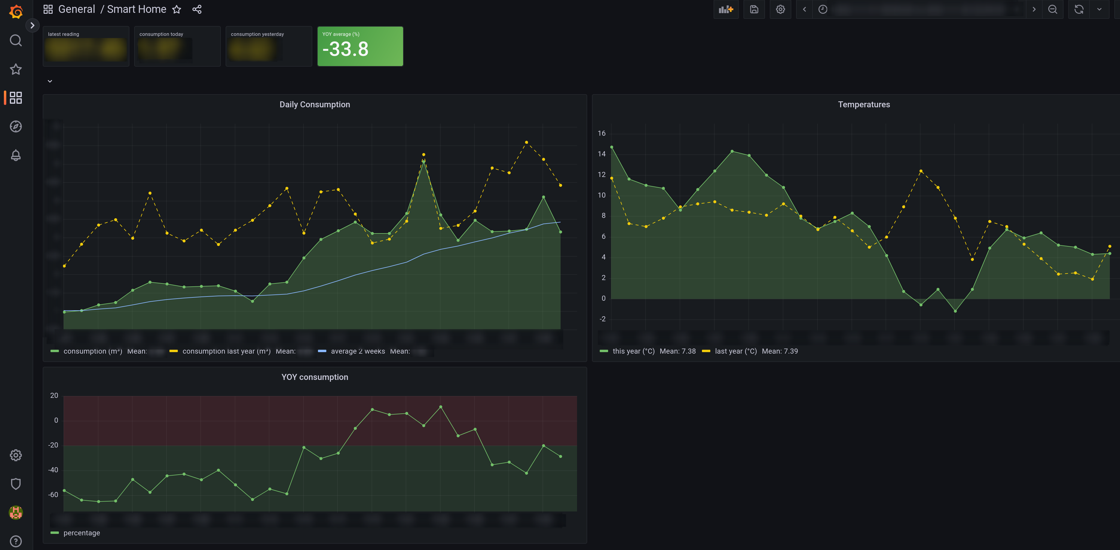
The Grafana dashboard I use to track gas usage.
- “Daily Consumption” shows how much gas we use each day. The green graphs shows current usage and the yellow, dashed one shows the usage at the same day one year before. The blue line represents the 14-day moving average of daily gas usage.
- “Temperatures” is just that, the daily average temperatures of where I live from this year and last year.
- “YOY consumption” represents the year-over-year difference in consumption in percent. Negative values say “you used less gas than last year”.
Then there’s four tiles at the top:
- “latest reading” is the last value read directly from the meter. My main use for this is so that I don’t have to go to the basement to report the yearly meter reading to my provider.
- “consumption today” is today’s total consumption in cubic meters. Handy for a quick glance to see if I should have a hot or cold shower today. 😉
- “consumption yesterday” is the same just for yesterday so I can quickly see if we’re on track for today.
- “YOY average (%)” is the most important tile showing relative usage compared to last year’s over the same time period. The tile is green if the value is below 20 and turns red if above. This is the one that shows if we’re on track for reaching the goal of 20% less consumption.
Hardware
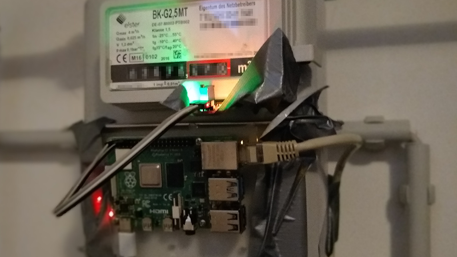
Ugly yet effective attachment of the Raspberry Pi and reed switch.
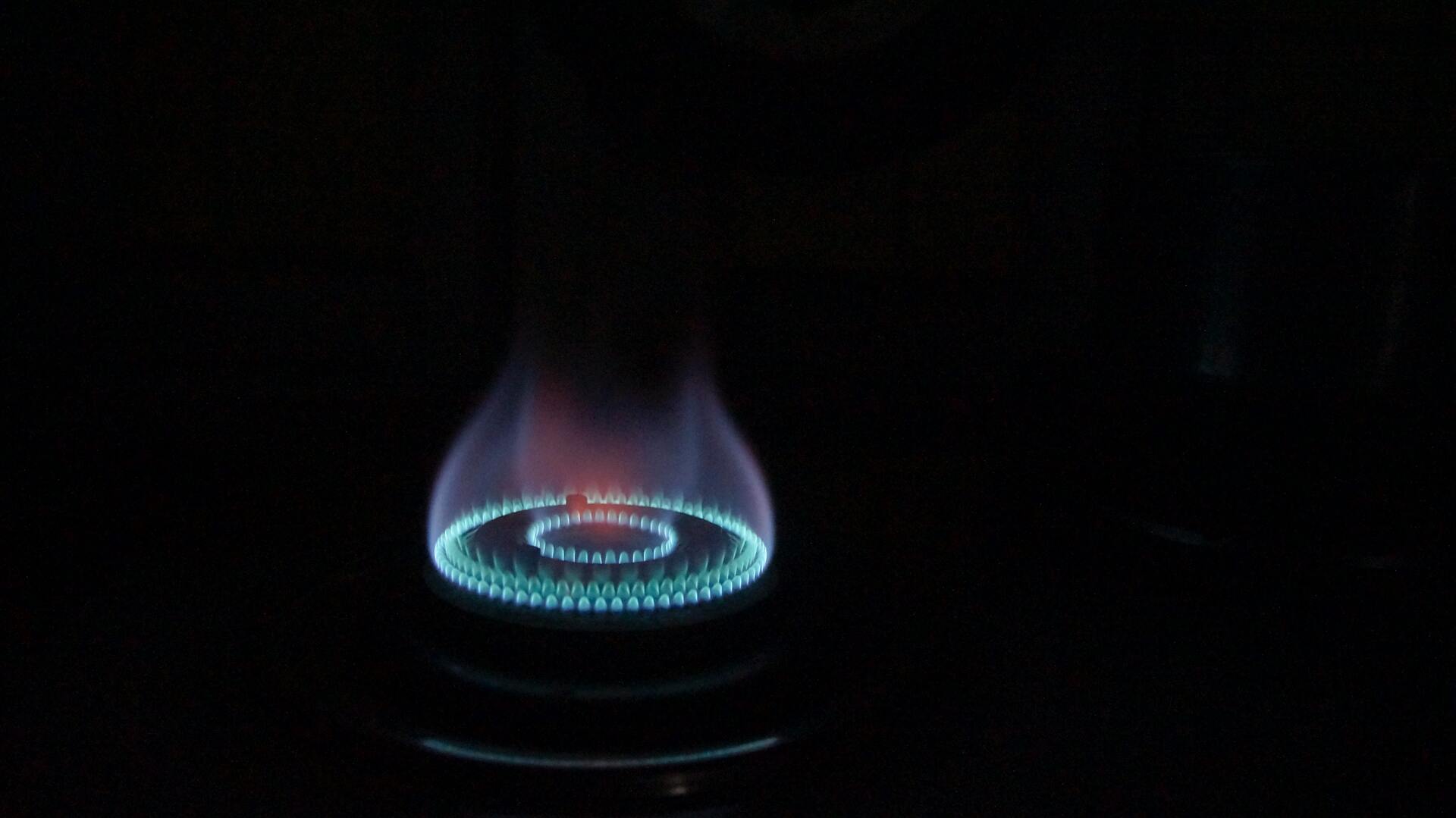
Most gas meters in Germany look like the one on the photo. There’s 8 mechanical wheels, 5 for the digits before the decimal point, 3 after. The rightmost one has a magnet at one position so that you can use a reed switch that triggers each time the wheel has completed a full rotation. This way it’s easy to capture readings from the meter with a precision of two decimal places which is absolutely fine for the purpose of tracking long-term gas usage. The Raspberry Pi is a version 3 model B one.
Temperature data source
As I said above I’m also capturing temperature data. Fortunately, the German Meteorological Service DWD offers free access to the data from their sensors, see their open data landing page for details (German only).
The capturing pipeline
In the first iteration of my attempt to visualize the usage I had everything running on the Raspberry Pi, a simple Python script using the awesome RPi.GPIO library that writes every state change of the reed switch into a CSV file. That CSV file was then processed by another bunch of scripts that generated graphs using Gnuplot. As more and more data accumulated, though, the static nature of this solution wasn’t enough. I needed to be able to zoom into certain time ranges and dynamically create new views on the data. This led me to the conclusion of using Grafana as a visualization tool.
The second iteration still has the capture script running exactly the same way as before. But now, a webserver serves the CSV file to remote consumers within the LAN in my house. This webserver is spun up with a simple call of python3 -m http.server. While Grafana has a CSV data source plugin available, I felt the need for a more flexible solution to persist the readings as I wanted to have the ability to derive statistics from the raw meter readings and store them as well. I already had Kubegres installed in my Kubernetes cluster so spinning up a PostgreSQL database was as simple as creating the Kubegres manifest file and storing it in Git.
Transforming the data from CSV and storing it in the database required a little more effort: I came up with a Python program that queries the webserver for the CSV file and stores the raw values in the SQL database. In addition, it also fetches weather data from DWD and stores it in another table of the database. Last but not least it updates per-day consumption stored in a separate SQL table.
That Python program is wrapped in a Docker container so that I could create a Kubernetes CronJob that would fetch the CSV data and update all the tables on an hourly basis. The weather data is ingested daily by another CronJob running the same container, just with different parameters.
For Grafana all I needed to do was create a data source connecting it to the PostgreSQL database and then create dashboards from the data the way I needed them. I’m persisting the Grafana installation itself as well as the dashboards in Git as well for a pure GitOps workflow and easy recoverability from any failures. The diagram below outlines the processing pipeline:
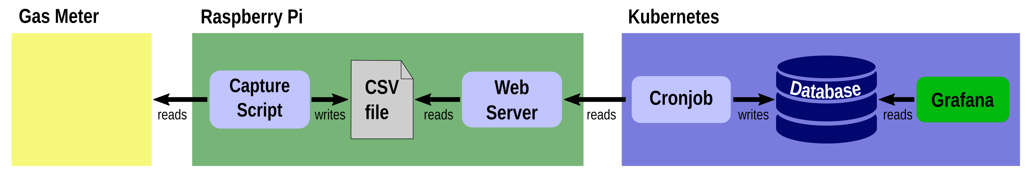
This is how data travels from the gas meter into Grafana.